The Numbers
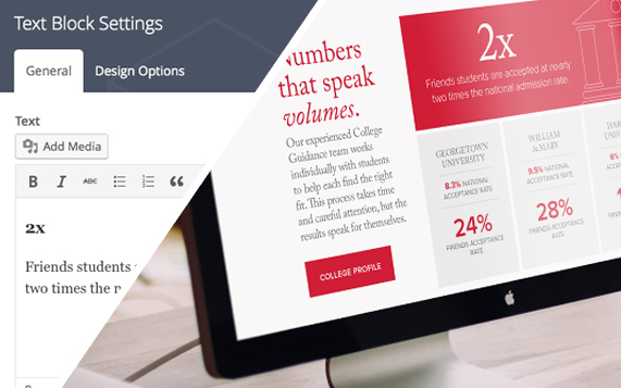
As we became familiar with Friends, it was impossible to miss that the school boasts some pretty impressive statistics. The Viewbook interface showcases these numbers, and many include subtle animation.
Of course with every passing year, these numbers might change. So on the administrative side, we built custom tools that allow each statistic and any associated photos to be easily updated.
Virtual Visit
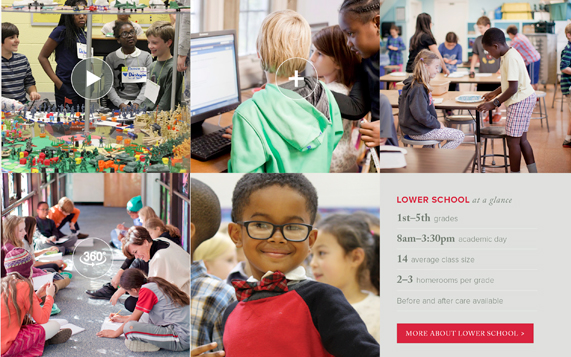
A 360-degree view of an empty classroom would not provide an accurate view of Friends because it wouldn’t include the most important part of the school—the people. What sets Friends apart is not its facilities, but the people that fill them. Realizing that this would pique the interest of parents and potential students, we suggested a tour that captured the people of Friends, with the facilities as their backdrop.
We identified the types of media that would be included and built out the components of the tour to be completely editable. Friends School has control over every aspect of this multimedia section, from adding photos and 360-degree tours to the ability to build customized “interactive photos” on the fly.
Messaging
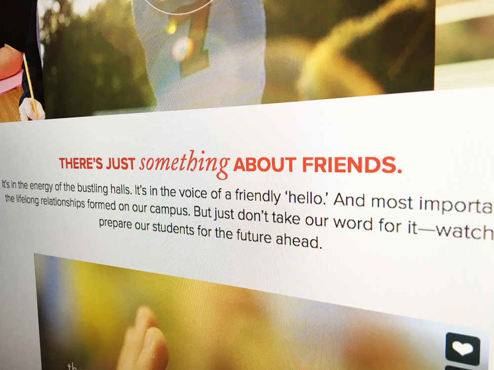
Friends envisioned the Viewbook content to be organized by the concepts of achievement, discovery, and engagement, and we took that and ran with it. We provided high-level messaging and writing support for many sections of the site. Friends found it beneficial to have a team with an outside perspective contribute to the site’s messaging. We were able to offer insights into how to shape the content and tone in a way that would engage the intended audience, prospective parents and students.
Friends can not only edit existing text, but can easily add new areas of text to the site if needed. Being an educational institution, attention to detail is especially important—text areas include rich text editing capabilities and automatic spell check.
Our goal was to develop an admission microsite that engaged prospective families in a meaningful way. Foundry19 exceeded our expectations by creating a modern site with appealing fonts, attention-grabbing graphics, a fantastic visual layout and most importantly the site stayed true to our brand image. We were so impressed with their creative; we asked them to design our admission viewbook. The viewbook is stunning and also does an excellent job communicating our messaging. Both the microsite and viewbook have received rave reviews from prospective parents, faculty members, alumni, and current parents. Hats off to the Foundry 19 team!


